Prefer to read the full case study on Medium then click on the icon below, or if you would like to find out more about me, then click on the LinkedIn icon to be taken to my LinkedIn profile.

Postary is a website that aims to help business with direct marketing campaigns by allowing their clients to design A5 postcards with marketing information that can be mailed out to their list of clients, uploaded to Postary’s website, and help grow their business and allow Postary’s clients to track their campaign success rate via online tracking stats. That is what we knew but we still had some questions…
Why did Postary come to us? what were their goals? what did they want to achieve? This among other questions needed to be answered so as part of our kick-off meeting interviewing the client to understand their requirements was a good place to start. From this interview, we gathered the following.
- Increase the number of visitors to the site.
- Improve the user flow through the site.
- Content and layout can make a difference to a users perception of a site
- Ultimately looking to redesign the website —either parts or the whole website, whether it be to create addition or modification of pages.
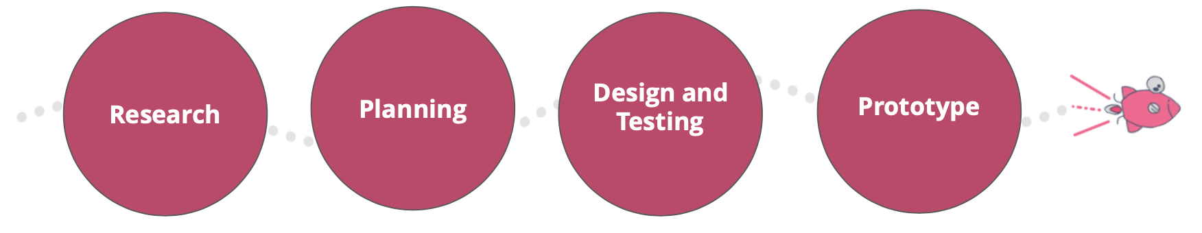
Website Redesign
Tools used: Sketch App and InVision
Techniques used:
1. User research (Online Survey)
2. Domain research and Competitor analysis
3. Affinity Diagram
4. User Journey Mapping
5. Information Architecture
6. Wire-framing
7. Concept sketches on paper
8. mid-high fidelity Prototyping
9. Usability testing
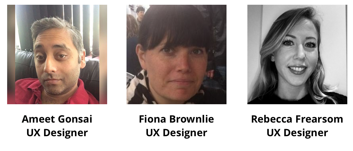
The Team

The Client were kind enough to provide us with a good amount of information as well as their own testing they had previously carried out, as well as the actual brief regarding this case. After digesting the brief, the 4 main points that I felt that needed to be tackled were
- Convert users to go through the site to the web app
- Educate users on Postary’s service and provide resources
- Optimise the landing page and increase user flow
- Increase awareness of Postary’s carbon neutral initiative
the UX process
It was important to outline the overall process to the client so that they were aware that despite it being a website redesign, instead of the creation of a website from scratch, that we were intending to carry out our own research, even if they had provided their own for example, and so they knew we had a methodical approach.


Upon looking through the information they had provided as well as their own testing, which included A/B testing, the 3 main points I was able to initially obtain were:
- A Minimalist design
- Not immediately obvious what service Postary offers
- Not a succinct transition from website to the portal

As part of this project, I was given access to their google analytics which were based on 3 months traffic through to Postary.com. This proved vital because from analysing the data results we obtained, this helped identify key areas that needed to be focused on when redesigning their website. These are listed below:
-66.94% Bounce Rate — this indicated the content on the page was clear enough to keep the visitor engaged.
- Average of 2mins spent on a page by a visitor — visitors to Postary were not spending enough time on the page which indicates low engagement
- Can’t see complete conversion rate need Google Tag on a Welcome page — due to Tags not being included vital conversion information was being missed
- 92% New Visitors and 7.6% Returning visitors — visitors were being attracted but had no incentive to return.

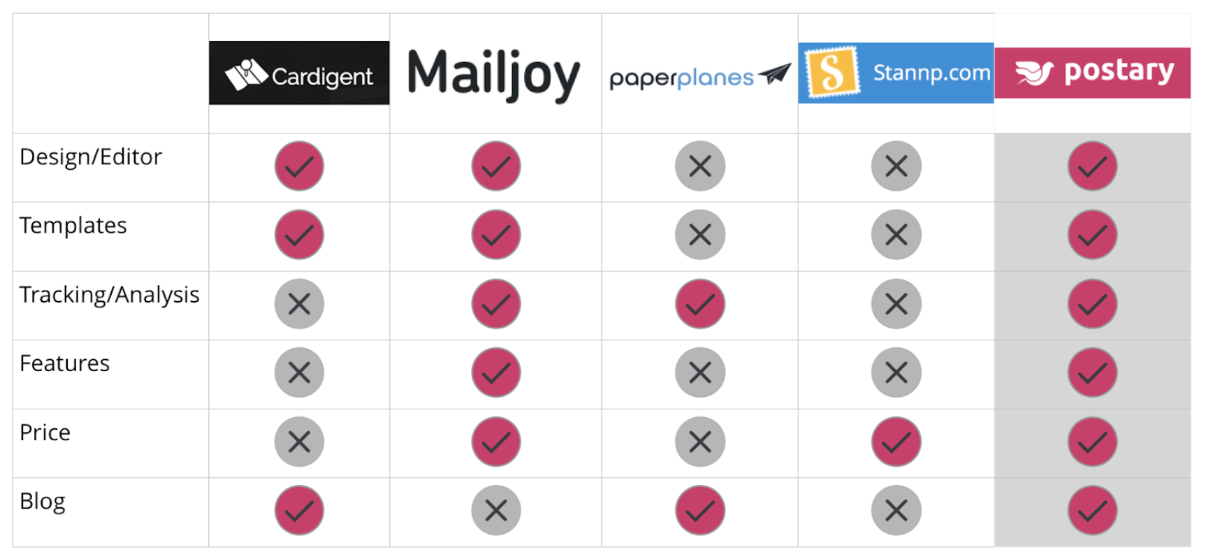
I had been provided with a list of competitors and also found a few of our own however we whittled this down to a few which had differences I felt would be beneficial when looking at ways to improve/redesign Postarys’ site. They were all offering a similar service but the main area of focus was the way at which they had chosen to layout/display their content and what they felt was required to include to inform users what they can offer. One thing I realised was that we wanted to stay with Postarys’ choice of colour and their more relaxed friendly yet informative tone. However, both the copy and use of images, as well as layout, were things that were immediate things that needed to be revised.
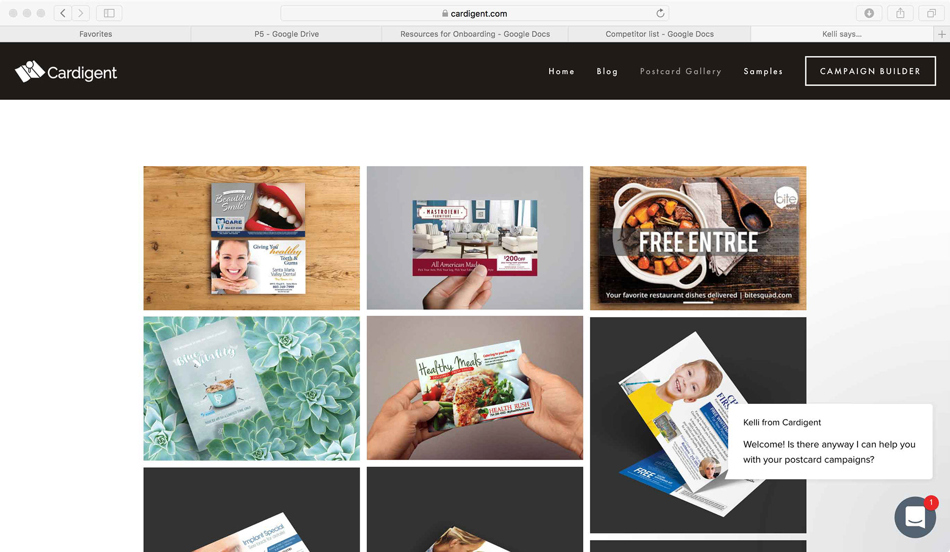


From carrying out the domain research I was able to identify the features on Postarys competitors and compare them to what Postary currently displays. I identified certain features we felt would help with making the site more informative to the user so they knew exactly is about and what they can offer on the homepage that was initially missing.

We appreciated that the client had carried out their own research which involved A/B testing of their site, but we wanted to carry out our own research in order to try and uncover additional insight form users that would also shed light on what users are looking for when requiring a direct marketing campaign site. We carried this out as an online survey and aimed this towards individuals who own small/medium business and also work in marketing. Amongst the many great responses, two questions provided 2 key things that would help clarify how to use the site, as well as increase the sites SEO (search engine optimisation), are shown below:
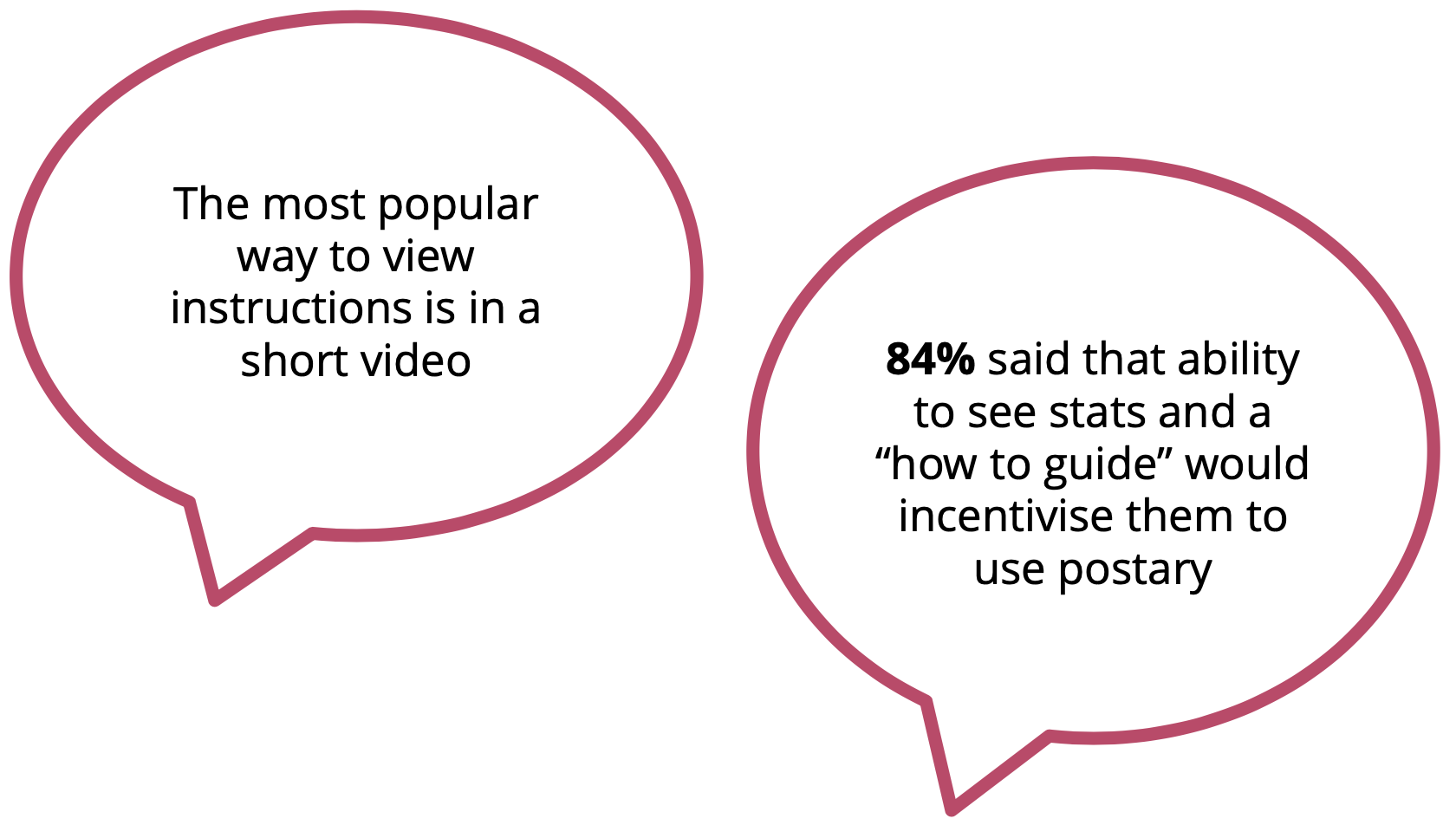
Two key points from the survey

After carrying out the research we decided to come together and note down all our findings to create an affinity diagram which helped us identify Postary’s current features and possible features that we thought could be incorporated into their redesign and aspects of their competitors we thought were also useful.
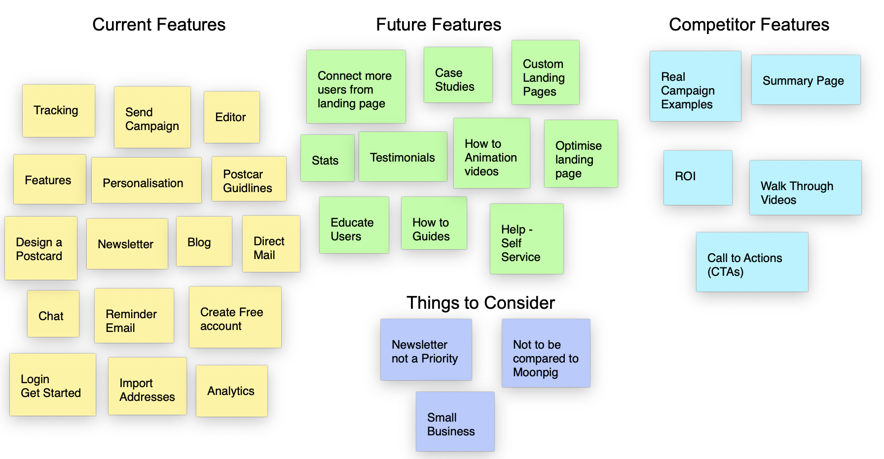
Bringing our thoughts together

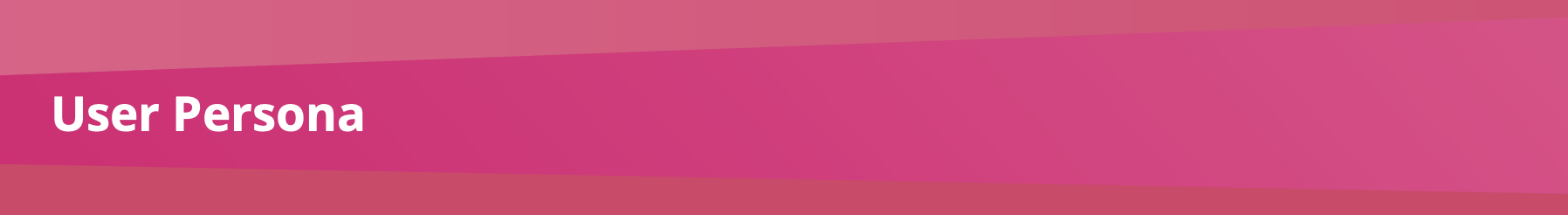
From the online survey, we were able to gather enough information to create a user persona that we felt represented a type of individual that would use or require Postary’s services and identify their goals, frustrations and motivations when looking for a good direct marketing campaign site to help grow their business.


We felt Ertha was an individual who, when coming across Postary’s site, would be the type of individual who would want to know a lot about what Postary does and look at examples but also want to see results so that she knows her ROI (Return on Investment) is achievable.
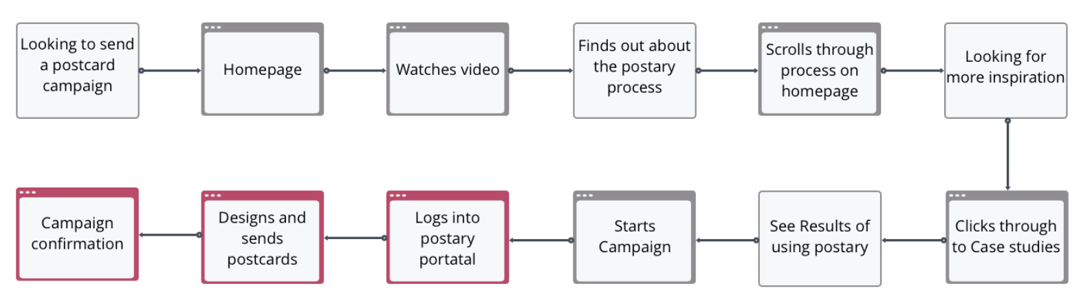
Eartha's user flow
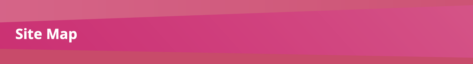
When redesigning a site we felt it was important to look at the information architecture and topology and it became apparent that information on the site is great but some of it could be collated under one section which would result in the visitor to the site not needing to click through to various pages and in turn keep the user more engaged and icnrease the time spent on a page/site which could then lead them to sign up and assist with conversion across the site.

Existing site map


We all went away and came up with our own sketches/interpretations of what we felt the site should look like. one thing was common was felt that the homepage needed the most work and if done right could have the biggest impact. Each of our sketches proved valuable as they all had interesting ideas that we felt could be combined to create an overall initial vision when moving towards wireframing.
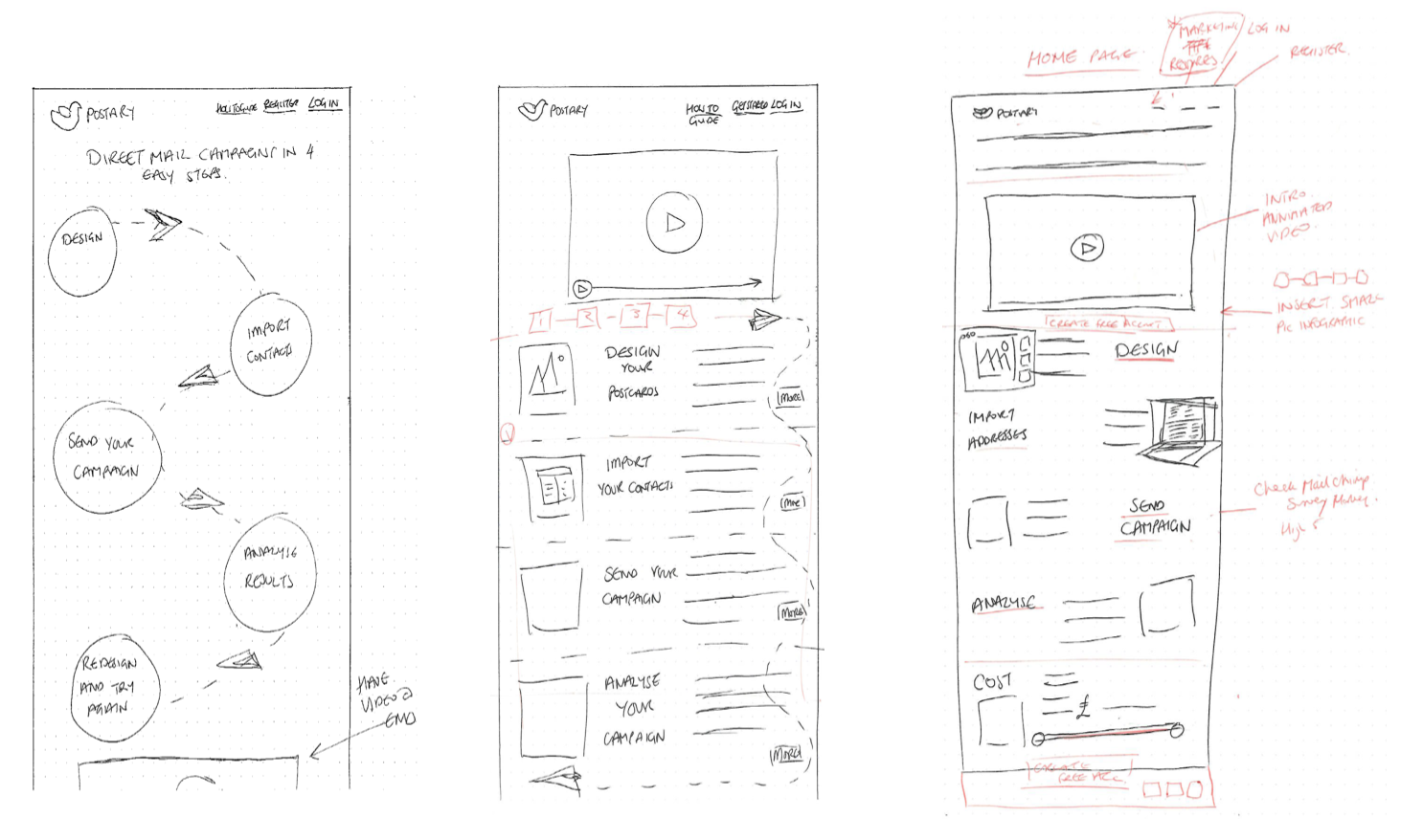
Initial UI sketches — putting ideas on paper

It was important to carry out testing at each stage by asking testers to tell us what they thought the site is for and also for them to carry out certain tasks to ensure the sites usability was clear enough. The results helped us when it came to the additions of CTAs the right images, or the inclusion of copy (text) correctly worded in order to ensure a visitor to the site was fully aware of what they could do and how they could traverse the site in order to find out more or even get started. We felt it was important to use images Postarys UI individual was creating in order to help the client see what a final actual site could look like and give the layout change more impact.

Variations on the design through testing


After carrying out the designs and redesigns following results of testing, we were able to build a prototype using Invision to allow the client to see the site in action and how the changes in layout, use of copy and new images can make such a massive difference and really aid them when it came to ensuring visitors to the site knew exactly what Postary is and what it can be used for.


When starting and working through the project we were not only thinking of what to deliver but what could be improved in terms of layout but also what would be beneficial moving forward for the next phase/version 2 and for further work in the form of features that we had initially discussed with the client or discovered along the way, but were unable to include in the final design and build.
- Enhancing the use of Google Tags — this would provide further results via Google analytics in order to get an even better idea of site conversion.
- Designing the self-service portal —this was something the client had mentioned but due to lack of information and time constraints this couldn’t be achieved.
- Look at a full site redesign — even though the google analytics and our own research indicated the main area for change was the homepage we felt looking at the whole site by redesigning other pages and thinking of new content would further increase site visitors and signups.
- Newsletters & hints for improving campaigns — a suggestion was given to the client to include this as part of their emails to their own clients when sending tracking results of clients campaigns. as this would give users the incentive to return to the site and also increase the number of users returning when considering analytics.

Following the presentation, it was wonderful to hear the great feedback we got from the lovely individuals at Postary a few quotes are shown below. it was great to know that we have given them some great ideas and a possible direction to take with regards to further work/redesigning of the site. It was an absolute pleasure to meet them and be able to work on this project for them
“Ameet Gonsai is Brilliant, the project was delivered very professionally and uncovered some fantastic idea’s we are excited to put into use asap”
“I’m so glad we had Ameet, Fiona and Rebecca on the project, they worked really hard to understand our exact requirements and our customers problems. They went above and beyond to deliver an excellent piece of work within the timeframe provided”

Prefer to read the full case study on Medium then click on the icon below, or if you would like to find out more about me, then click on the LinkedIn icon to be taken to my LinkedIn profile.