Prefer to read the full case study on Medium then click on the icon below, or if you would like to find out more about me, then click on the LinkedIn icon to be taken to my LinkedIn profile.

The Brief
DigitalHealth.London were aiming to hold a showcase and prior to this, were hoping to redesign their website in order to highlight this but also incorporate their new objectives and emphasise the services they provide to NHS and industry related professionals. To summarise, what we were trying to achieve was:
Redesign the current Home and About page on the DigitalHealth.London website
Promotion of the upcoming DigitalHealth.London 2019 Digital Pioneer showcase
Increase engagement & views of DigitalHealth.London Website
Summaries of research findings and other research assets.
The Team

Responsive Website Redesign
Tools used: Sketch App, Photoshop, Wordpress and Divi
Techniques used and areas of interest:
1. User research
2. Heuristic Evaluation
3. Domain research and Comparative analysis
4. Content analysis
5. User Personas
6. Web Analytics
7. Red Route Mapping
8. Information Architecture
9. Low to mid-high fidelity
10. High Fidelity/Final iterations
11. Usability testing
The scope of work:
An initial kick-off meeting was held in order to go over the initial scope of work that had been discussed in order to ensure what exactly was required and whether such work could be carried out given the already reduced timeframe. It became apparent to revise the scope of work further to ensure a high calibre of work could be delivered within the designated limited timescale. this is due to certain deliverables would require not only more time than was currently allocated but additional resource and access to certain client members and their input.

What does DigitalHealth.London do?
In order to understand what DigitalHealth.London (DHL) do, part of the research was to read through the draft report they would be presenting as part of their 2019 Digital Pioneer Fellowship Showcase. Like similar organisations, they are trying to provide navigation for small to large SMEs, NHS professionals & Clinical Commisioning Groups (CCG’s) in order to bring the NHS to a digital future. The report expanded upon the various ways this can be acheived via 4 objectives.
Taken from the DHL Impact Report:
Bridging the Skills Gap — We bridge the skills gap, building knowledge, insight and capability for health and care providers and commisioners.
Building an innovation-friendly environment — By building an innovation-friendly environment, supporting innovative businesses, both large and small, and both local and overseas.
Global engagement — Through global engagement, attracting best-of-breed digital health innovators to the capital as well as helping home-grown digital companies establish a presence in international markets.
Bringing together communities — By bringing communities together, to gain insight into the real issues, concerns, and needs amongst our stakeholders.
We took these to be our objectives that we felt both the Homepage and About page needed to meet and convey e.g. when considering its possible layout and use of copy, amongst other things taken from the current site and draft report.
Research Areas
I felt certain areas would provide the most insight when creating a good foundation or initial indication of what the websites currents issues are, how these can be rectified in order to achieve our objectives and meet client goals. Whilst most importantly delivering an informative engaging user experience.

- Initial symptoms, information gained on first glance and from first contact with client.
- Existing DHL Research, including user interviews, user journey mapping and persons.
- Website Analytics
- DHL Impact Report
- Comparative Analysis with existing & similar websites
Initial Symptoms

What are the current issues/challenges with the DHL Website in relation to the scope of work? From our initial interview with the client, when also confirming the scope of work, the current areas of improvement I took from this meeting were:
1. Need to increase the number of visitors to the site / visitor engagement
2. Current site is not designed to showcase upcoming event
3. Making visitors more aware of who and what DHL can offer
4. Information currently presented not clear
5. Information architecture hinders navigation
User Feedback — Initial
We spoke to 6 people about the website to get their opinions about the site. This included clinicians, entrepreneurs and the general public. They generally found the site bland and confusing and lacked clarity over what DHL actually.
“Which one do I click? NHS or Industry? I don’t understand”
“Why is this full screen? I clicked a dropdown box and now this pops up.”
“Are they a platform for giving general health advice?”
Existing DHL Research
This allowed us to not only understand our target audience but also identify existing issues with the site which, not being part of our existing scope of work, were noted in order to be highlighted as possible further work — this is explained further near the end of this case study.
- The main users of the website include digital health professionals of varying skills and knowledge, as well as those interested in digital health.
- The website has several usability issues which are making the website hard to use
Website Analytics

When looking at google analytics 2 main things were clear, the first gave me the confirmation that the sites current iteration was not making use of the homepage in terms of its content and call to actions (CTAs). This, in turn, would mean visitors to the site may not be signing up to the DHL fellowship and other innovative services.
- The website gets a lot of traffic, but people are not accessing much of the content.
- There are several thousands of users per month, more than half of which read the website in English.
DHL — Impact Report

When reading through the DHL draft report, I was able to identify a vast array of useful images and information that could be used for both pages we (Home & About page), such as:
- Revised objectives
- More informative copy regarding DHL programmes
- More relevant images
- Quotes
- Infographics
- NHS Digital pioneer fellowship in numbers
- Case Studies
Through the design phase it became apparent, and due to time constraints, some of the above would not make it into the final version. However, this does not mean they could be incorporated into a full website redesign and if this and an information architecture revision were to occur in the future.
DHL — Diagnosis

From going through the existing DHL research, baring in mind the clients initial problem areas and conducting our own research, we were able to to answer the following question; What are the current issues with the DHL Website in relation to the scope of work?
Usability of the site for new users
Users not sure what DigitalHealth.London is from the website.
Low page/session rate
Higher rate of joining programmes/mailing list wanted
Current level of homepage content not informative or engaging
Loads of content which is not easily accessible
Current use of homepage & about page real estate

Red Routes
Before introducing you to the user personas and their job storys and listing their red routes and it’s important to understand what red routes are. this helps us know what we are trying to aim towards/meet in order to justify and validate the decisions made during the design process. This will of course result in changes the versions of mock ups produced from low — mid — high fidelity (final version)
Red routes are:
Frequent and critical activities
Reflect key business objectives
Reflect key customer objectives
Characteristics of red routes:
Most complete tasks not simple activities
Must imply an obvious measure of accomplishment
Must be portable to any website
Must focus on goals and not procedural steps
Must be accurate and realistic
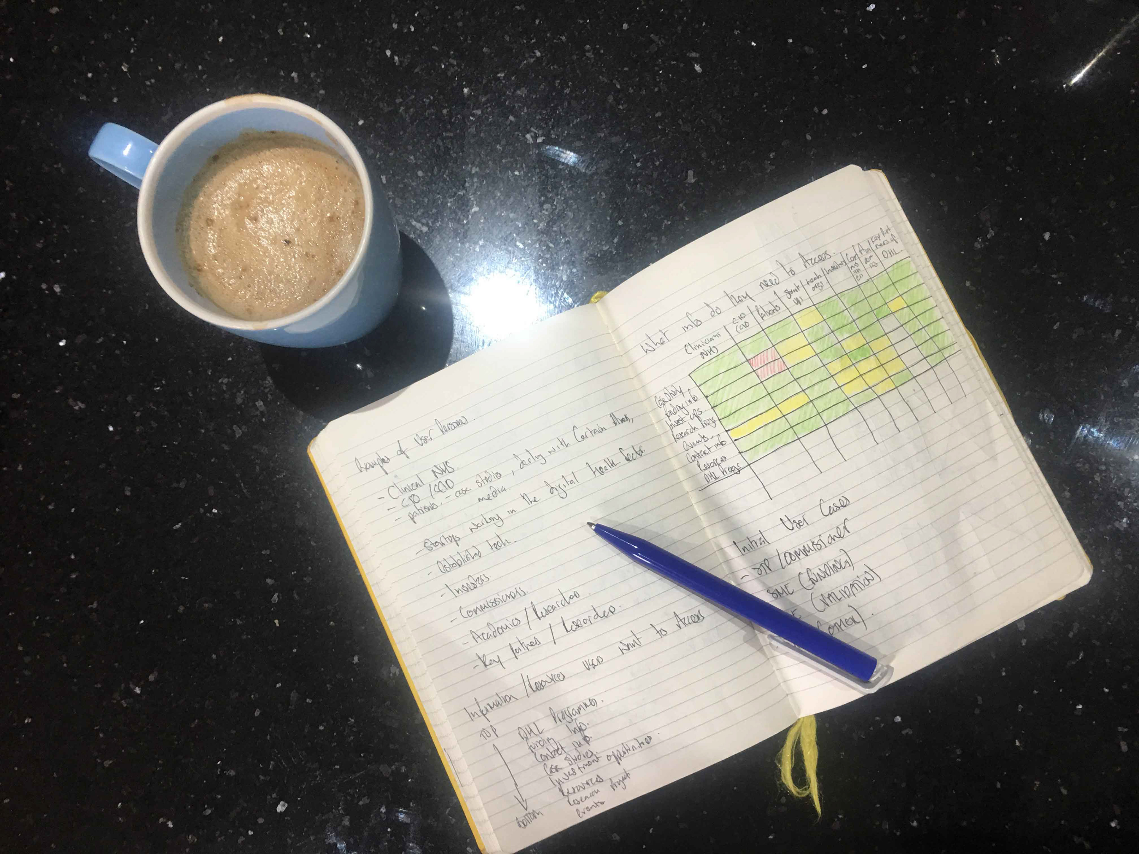
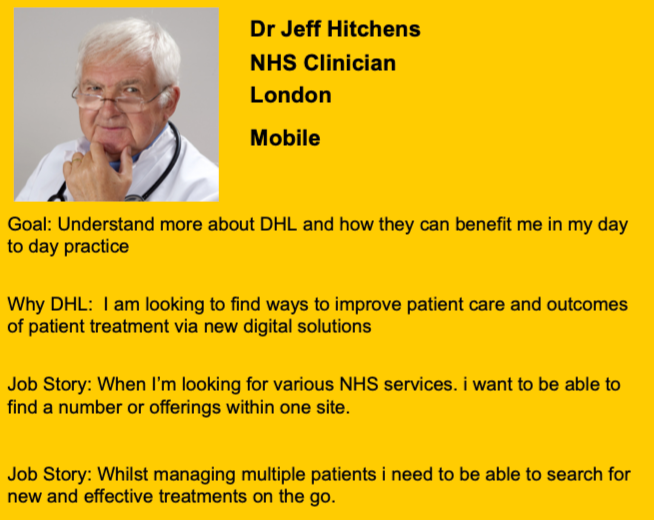
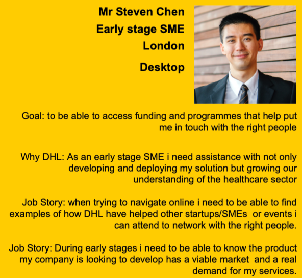
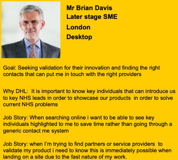
User Personas & Job Story
Through research and speaking to individuals who are aware of DHL and their services i.e. their target audience, I created 4 user personas and I was able to identify their goals, why visit the DHL website?, and their describe their job story (most efficient red route)

Red route
1. Homepage
2. User presented with intro to DHL and latest upcoming event.
3. Scrolls down and presented with DHL video and Objectives (keys facts/figures listed)
4. CTA presented under objectives to be taken to the about us page (key item via google search)
5. Provides user with reliable information about DHL and companies/service providers in order to commision for their services.
Red route
1. Via Mobile Homepage
2. User presented with into to DHL and latest upcoming event
3. Scrolls down to presented with DHL video and Objectives (keys facts/figures listed)
4. Scrolls down towards the DPF
5. Relevant copy within about, benefits to fellows and images of partners with the addition of an informative video from the previous fellow is the right level of information to want to click CTA as confirmation of NHS services can be provided by the DPF
Red route
1. Homepage
2. User presented with into to DHL and latest upcoming event
3. Scrolls down to presented with DHL video and Objectives (keys facts/figures listed)
4. Scrolls down to accelerator — identifies companies
5. Clicks more information/additional CTA to a results page with further news/articles (results page is shown when the user clicks through explore support &services filter)
Red route
1. Homepage
2. User presented with into to DHL and latest upcoming event
3. Scrolls down to presented with DHL video and Objectives (keys facts/figures listed)
4. Clicks on CTA for about DHL
5. Scrolls to people section to access relevant contacts
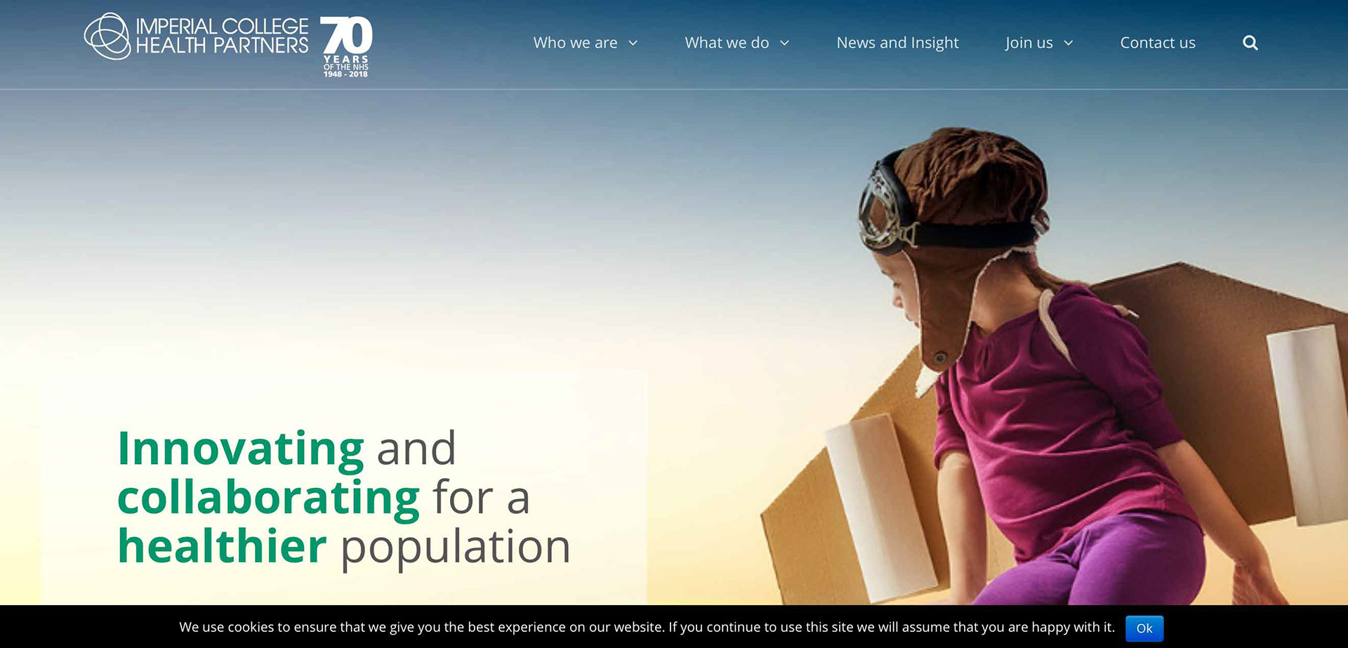
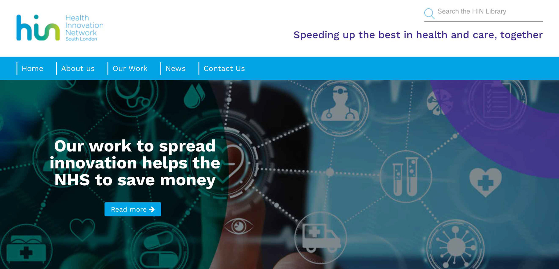
Comparative Analysis
Examples of similar websites:

Our focus & considerations for further work:
- Design
- Layout
- Content & Presentation

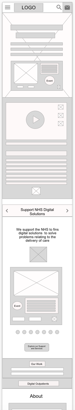
When reaching the design phase we realised only 2 pages were required to meet the client objectives. In addition to this, producing variations (different versions) of the each page in the Desktop and mobile iterations helped identify if they would worked if responsive and allow for red route feasibility.
Home Page & About Page
- The two main areas that when changed can have the greatest impact.
- Visitors want to know who and what DHL are about
Variations in layout
- Allows for comparison and call back towards the red route feasibility
- Facilitate effective use of the website
Supports the creation of designs that are Responsive, ie suitable for mobile and desktop
Low fidelity version 1
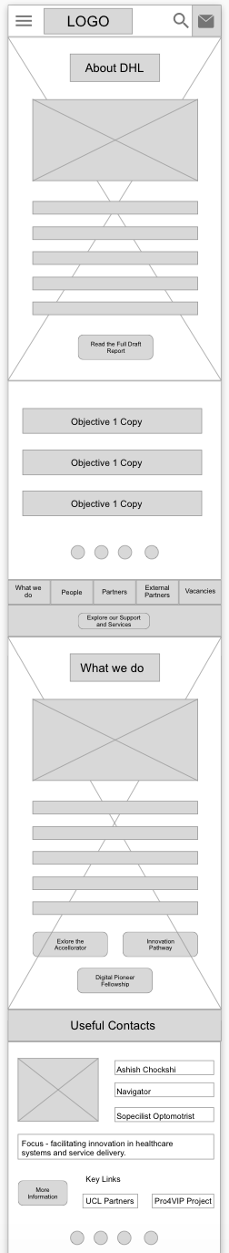
Low fidelity version 2

Low fidelity version 3

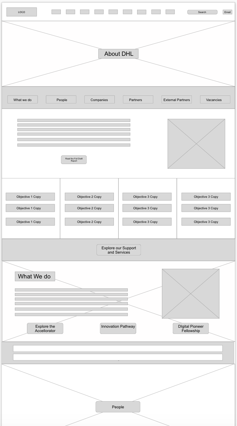

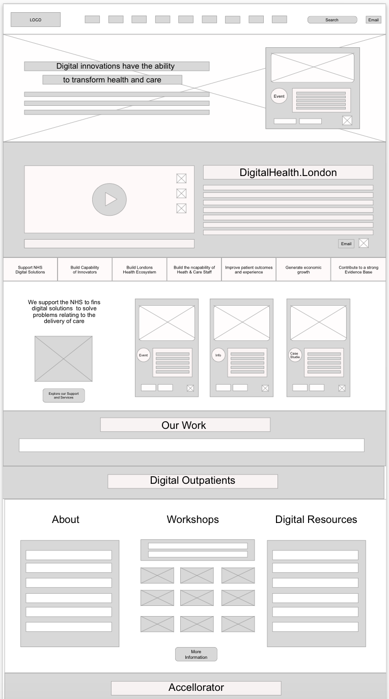
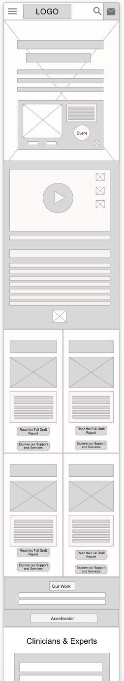
Mid fidelity version 1 — Desktop Versions only

The New Pages (Final Designs)
Please note these pages are yet to go live as they would require going through the change process, via a change authorisation board, in order to go live.
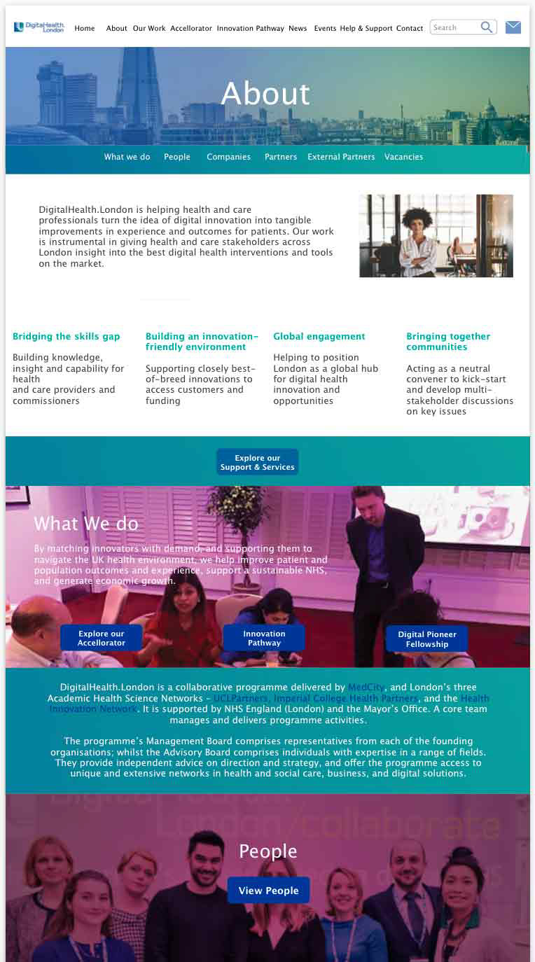
Existing websites url: https://digitalhealth.london
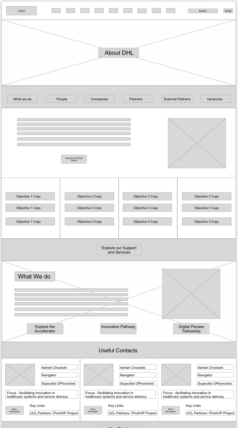
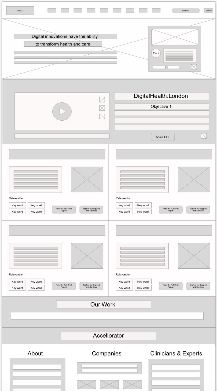
Homepage
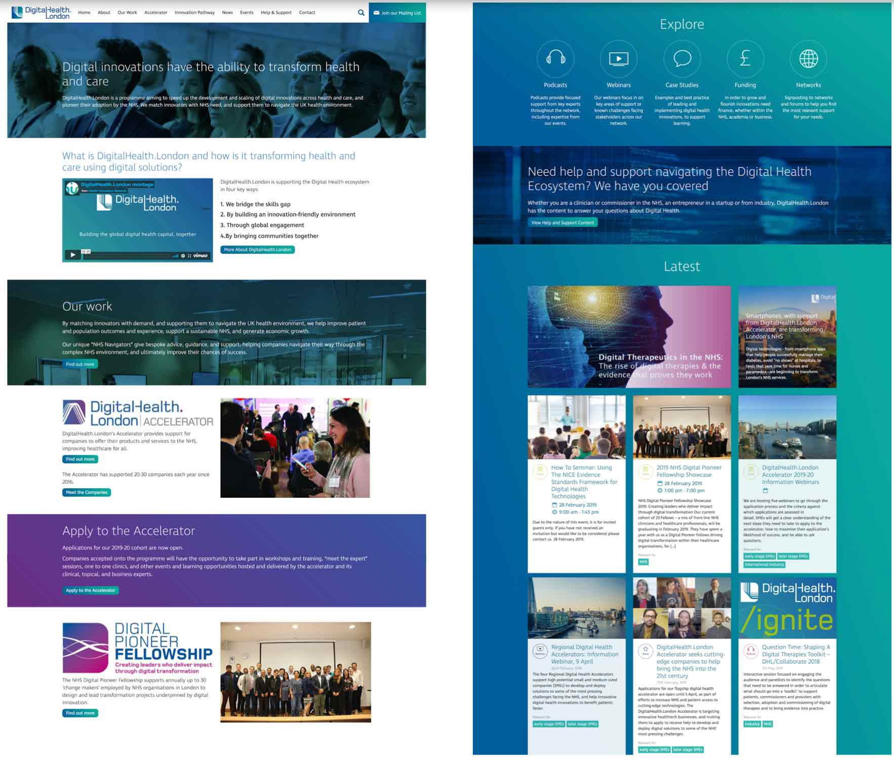
The New Homepage has a photographic image with a diverse audience visible, which is much more inviting than the existing image of a buildings used on the website.
The video from the About page is placed here as well as the 4 clear descriptors of what DHL does and a Call To Action (CTA) to read more on the About page.
There are now clear CTA for the Accelerator and Digital Pioneer Fellowship, with supporting images. Special attention is offered to encourage people to apply to the Accelerator
The Explore section from the Help and Support page has been reused to support users to go to specific content. There is a new section below which directs a user to the Help and Support page.
Then the current Latest and website footer are displayed. It is not visible in the webpage shared due to how that section has been coded by a previous developer.
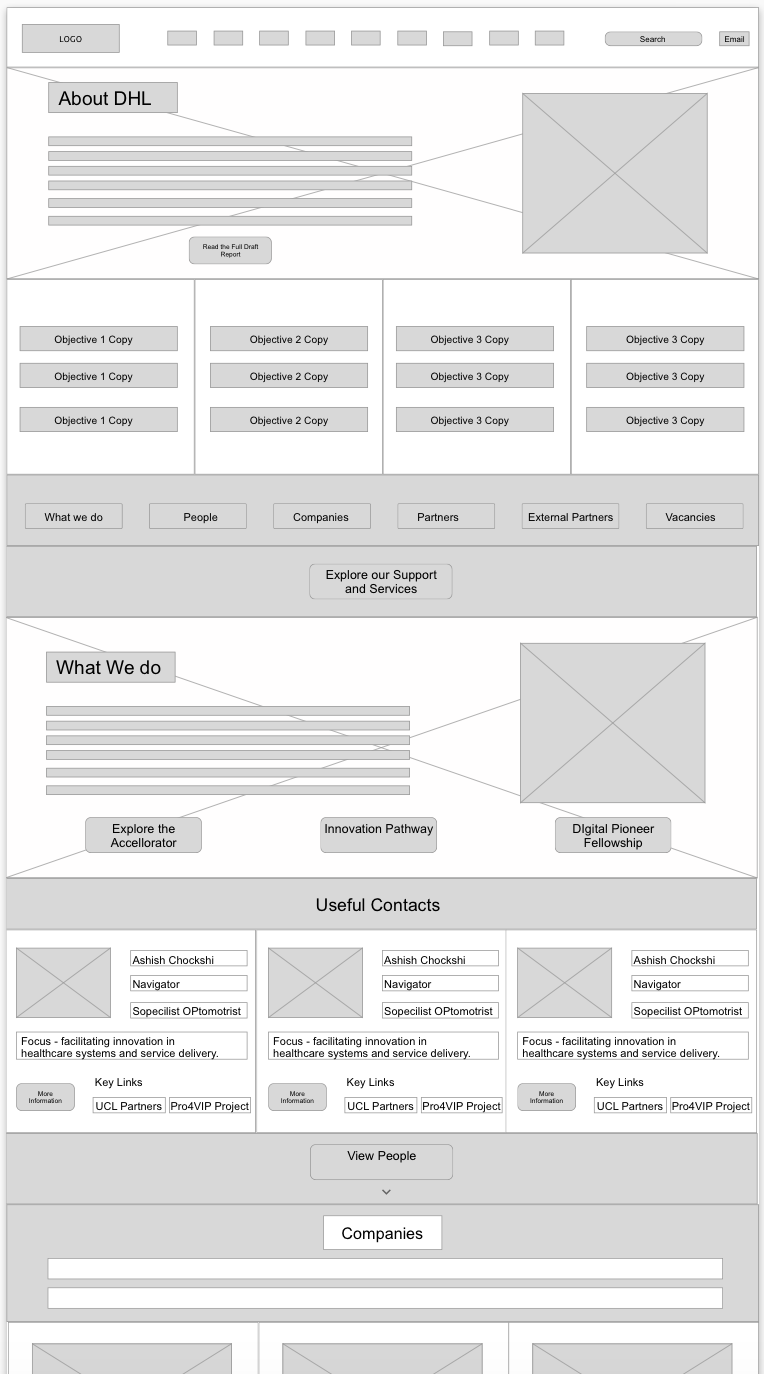
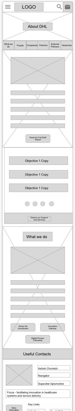
About Page

The header for the About page has been retained to ensure the page fits the design language already used.
Below this is copy about DHL and the video. Then the four areas of DHL work with appropriate CTAs and images are shown. We deliberately used content, both images and copy, from the DHL Impact Report, as we recognise this is great content that explains DHL very well. It also allows the website and the DHL report to feel related. There is currently no CTA to download the report, but that would be very useful once the report is complete.
There is also a CTA to learn more about the People followed by CTAs from the homepage about reading engaging with content.
User Feedback — After
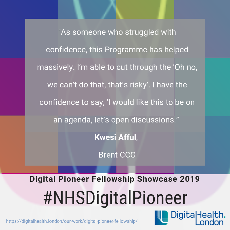
Following user testing with the new pages, it was clear that there had been a vast improvement in not only identifying who/what DHL does, but also the various services they have on offer, whilst making their objectives clear.
“This is so much clearer and much easier to understand.”
“I really like this, the four main areas that explain DigitalHealth.London is.”
“There is a lot more information, but I would read it, it makes sense and is inviting.”
“So Digitalhealth.London is a platform to learn, explore, create and deploy digital health solutions for the NHS? This is really good.”
“This is a lot prettier, but I’m still not sure if it can help me as a Commissioner…I just want to find a solution like Babylon… I don’t know how to do that.”
Prefer to read the full case study on Medium then click on the icon below, or if you would like to find out more about me, then click on the LinkedIn icon to be taken to my LinkedIn profile.