Prefer to read the full case study on Medium then click on the icon below, or if you would like to find out more about me, then click on the LinkedIn icon to be taken to my LinkedIn profile.

Our journey into the chronic world that is gut health began with meeting our client, who wanted to develop an alternative solution to the current medical approach to investigating gut health. This would incorporate prescribing easy to digest life-changing solutions for individuals, who are wanting a definitive diagnosis to their specific ailment, with the aid of a medically advised treatment path.
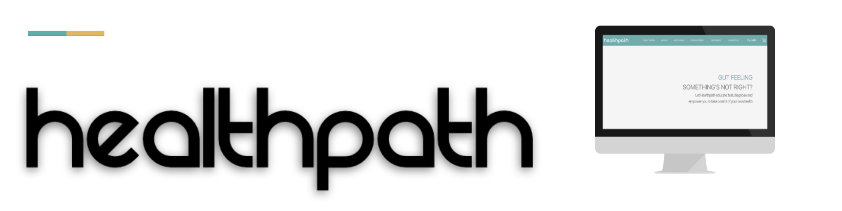
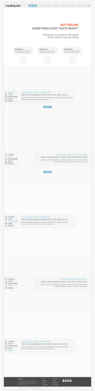
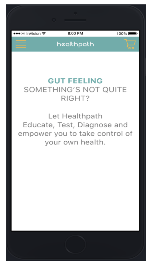
The end result we were looking to create was a responsive website that was usable on a desktop as well as mobile.
Responsive website
Tools used: Sketch App and InVision
Techniques used:
1. User research (contextual inquiry)
2. Content analysis (Affinity Diagram, Persona Development, Value Ranking)
3. User Journey Mapping
4. Information Architecture
5. Wire-framing
6. Concept sketches on paper
7. mid-high fidelity Prototyping
8. Usability testing
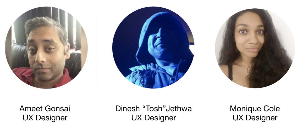
The Team

After digesting the brief, the 4 main points that we felt that needed to be tackled were;
Develop a Responsive Website for use on both Desktop and Mobile
Allow a user to purchase a product and services through E-commerce functionality.
Enhance the user experience by incorporating Learning Material
Educate the user on Gut health and take them on a journey from education to buying a product


So much reading!!...
Prior to conducting our own research, the client had provided us with their own well thought out, thorough research on their idea which we felt couldn't be ignored but not detour us from conducting our own research. Reviewing all their documentation and listening to interviews they had conducted gave us valuable insight into the following:
- Understand the clients' Reasons and Goals
- Initial UI Design and Wireframes
- Site Map and User Flow
- Tone and Image
Our initial journey into gut health research begins with the realisation of how many websites that are out there who are already attempting solving this issue, but also expanding on it with healthy meal tips as well but also looking at other health sites that tackle issues such as mental health by offering meditation.
The key difference was that our client wanted to do more than just offer a sales package, like how certain American sites come across, but an all-round solution from initially educating the “patient” to guiding them via their education to choosing the right test to diagnose their ailment. Then with the aid of a medical professional begin a program aided by probiotic supplements to reset their gut and move ahead with learning a new way of eating and track their progress whilst having the ability to reach out to their medical professional whenever possible.
Please note domain analysis and competitor research has been omitted from the article as per the client's request, but please feel free to ask me about it.
During our discussions with the client at our initial kick-off meeting one thing that was made clear was not wanting to appear like a sales site not to look like a site similar to the traditional UK health website but be comforting and empathetic to the user. By baring this in mind when looking at the competitors the following factors were taken into consideration when initially outlining what our MVP should be.
- Features
- Look and feel
- Colour schemes
- Typography
Specifically looking at the features that each of the competitors offers provided valuable insight into what we felt health path would benefit from incorporating or be influential when coming up with sketches, site map, user path and the overall information architecture.

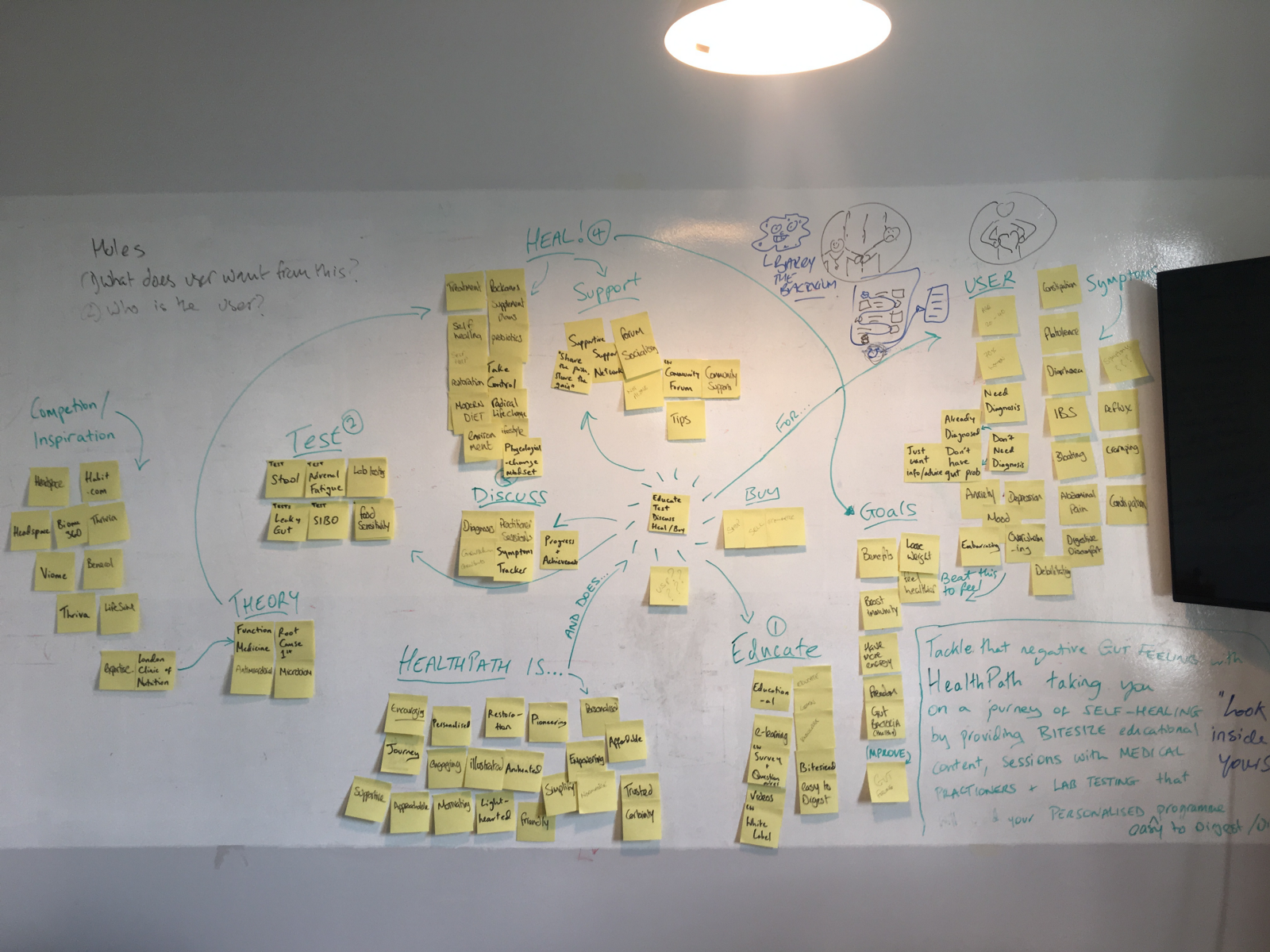
Once we felt we had carried out a substantial amount of research into the gut health domain and the various competitors that are out there, composing an affinity diagram helped identify certain aspects that we thought Healthpath represent of which two of them were to educate and the heal
We also were able to words from the affinity diagram to aid with constructing a mission statement, which we decided not use in the final product but did assist when looking for the right phrases and words to express the website's tone of voice.
“Tackle that negative gut feeling with Healthpath, taking you on a journey of Self-Healing by providing you with bitesized educational content and sessions with medical professionals and Lab testing that accompanies your personalised easy to digest programme”

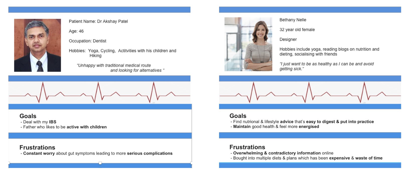
From carrying interviews with individuals and from listening to the interviews the client had provided, I was able to create 3 user personas, 2 of which are shown above which covered 3 different user types:
- Patient is sick and doesn't know whats wrong
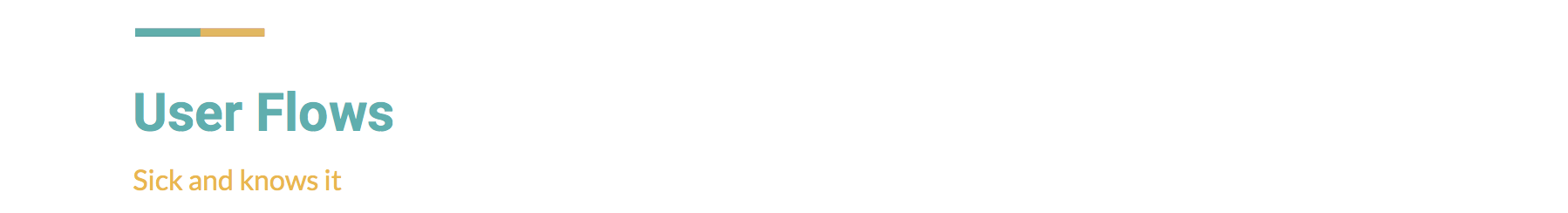
- Patient is sick and does know their diagnosis
- An individual wants to stay healthy and is curious about the site and services on offer

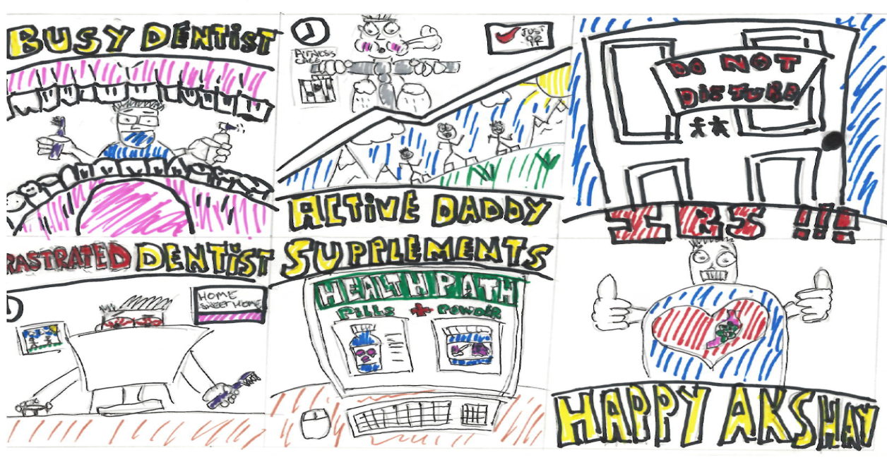
Akshay the frustrated IBS ridden dentist
Let's take Akshay, who is sick and knows their issue — IBS, who would benefit from such a website and is frustrated with the traditional form of medicine and feels with the aid of functional medicine introduced via Healthpath allows him to regain his life and resume what he likes to normally enjoy
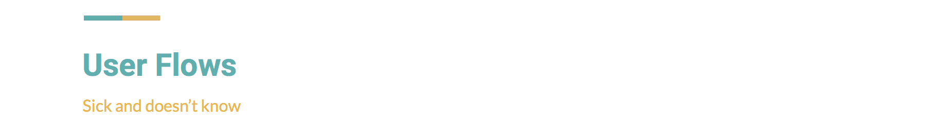
Betheny Neal who represents the individual who is sick and doesnt know would essentially want to explore the site more before going on to carry out and test books a consultation and a treatment plan and awaits her supplements.

The full “patient” experience
Dr Akshay Patel represents the individual who is sick and does know and would essentially want to get straight to obtaining the right supplement to treat his condition.
Finding the right product
The third individual who represents the individual, and possibly quite a few people who would come across the site due to attitudes of healthy eating and lifestyle choices becoming more apparent in today's society, who is not sick but wants to stay healthy

Wanting to learn more

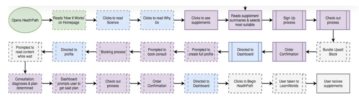
From the user flows it helped us defined the overall site map and identify other areas that would be benficial as well as getting the information architecture right.
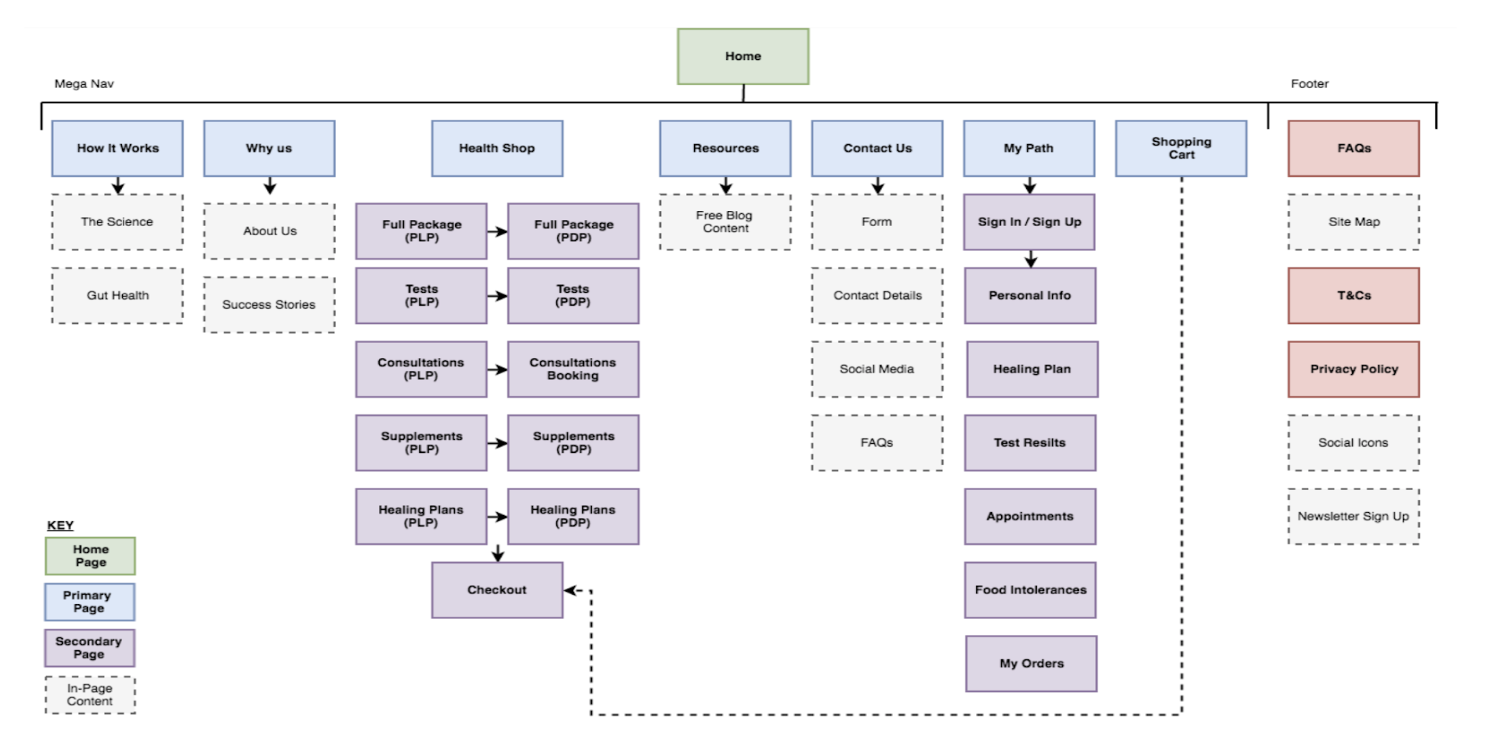
Healthpath Site Map — the overall journey


Getting out images down on paper and creating a single vision. By each member of the team creating their own sketches, it allowed different thoughts on what would work best and then deciding upon what could be combined.
Draw. Debate. Draw. Collate.
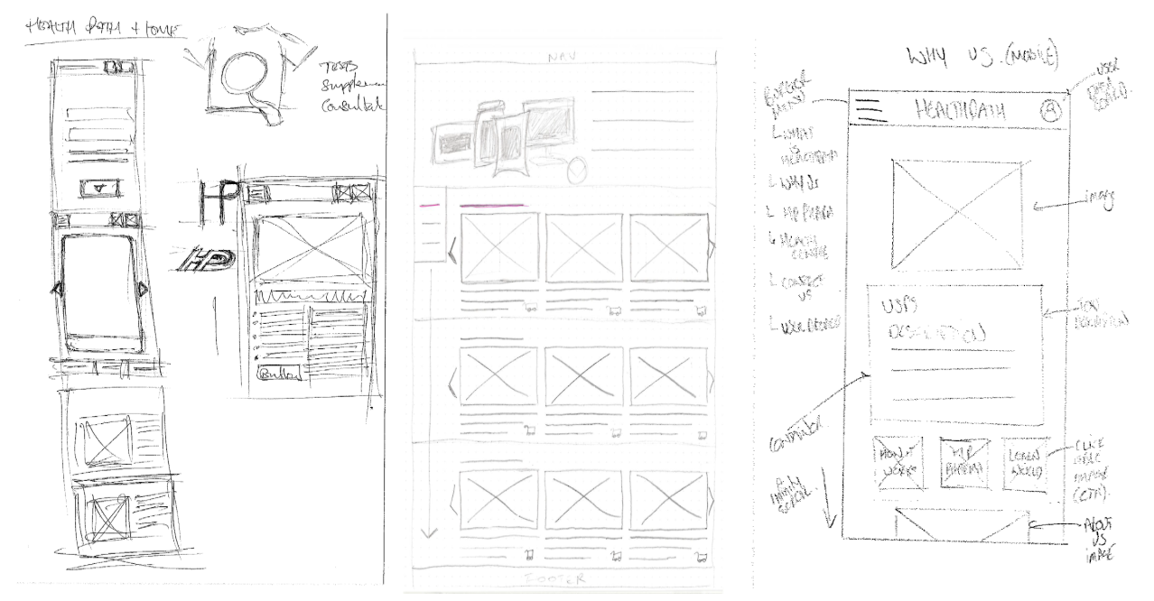
Combining initial ideas

Correcting initial design flaws. Continuously reviewing the designs and calling back to features or layouts from other competitors and also other websites resulted in multiple versions of certain pages beign created such as the homepage. Adding testimonials, tabbed view and call outs were things that we thought would possibly add to the user experience.
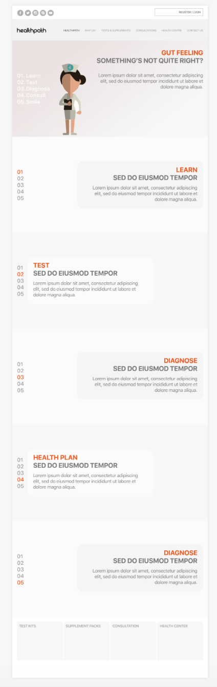


Bringing our vision to life. Once decided on the direction to take introducing the right choice of colours and images helped define what a user could expect from the final product. This involved establishing guidelines, images and colours that would add to the overall comforting yet informative aesthetic.

Improving aesthetics

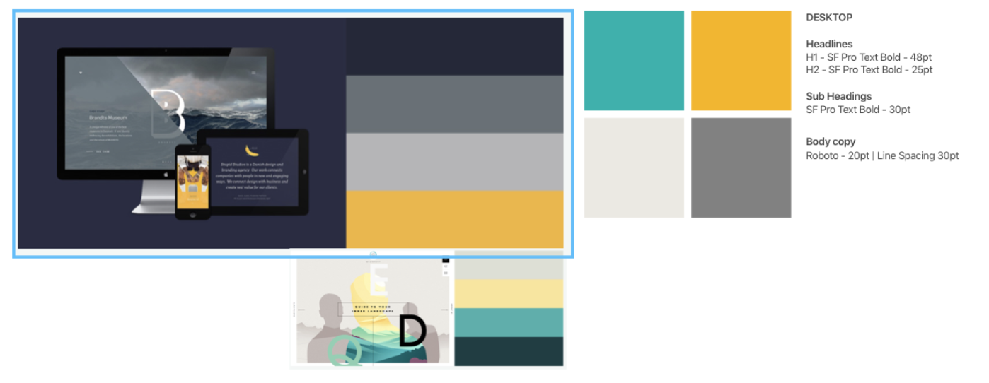
When looking into the right colours to chose braing in mind the client wanted to stay away form the NHS look it was still important to bare in mind other alternatives that also relate the health and healing as well as giving and educated informative look.

Despite not being able to build a fully responsive website, when designign the desktop version mobile pages were also created at the same time which ensured we were contunuelly taking into consideration how the layout and navigation would change as a result.
we were able to produce two prototypes — 1 desktop and 1 mobile so that the client was able to see how both worked whilst taking them through the user journey throughout the site.


Throughout the whole project, we were not only thinking of what to deliver but what could be improved upon and what would be beneficial moving forward for the next phase and version 2 or features we were unable to incorporate in this current design and build.
- Further Development of the dashboard area — incorporating better analytics or more statistical data represented in easy to digest infographics so the individual has a better more in-depth understanding of the test results or the programme status.
- Incorporating E-learning within the site — rather than taking the user away it would be better to still keep them within the site to further encapsulate the all in one solution that is Healthpath.
- Further testing — to further probe into site usability and features in order to identify what else could be improved upon or added to ensure the intuitiveness of the site allows the user to easily flow throughout each page.
- UI development — adding more specific images relating to health/gut health and actual text relating to the topic.

After presenting this to the client and going through the prototype, the client really felt we had nailed it and certain aspects that they were unable to get their head around we solved for them such as the initial onboarding of the user to the initial journey of the website. There were also other things he felt we had brought to the table that they were definitely going to consider to include moving forward.
Prefer to read the full case study on Medium then click on the icon below, or if you would like to find out more about me, then click on the LinkedIn icon to be taken to my LinkedIn profile.